VIPsocio

An events ticketing platform, marketplace and event related services hub.

A mockup image of the VIPsocio event landing page
Role/Service

UX Design, Proposal & Consultancy

Timeline

March 2023

Platform

Website

Tools

Pen & Paper, FigJam, Figma

Overview

Context

VIPsocio is a business and a website for buying and selling event tickets and other items and hiring influencers. I met with the CEO and marketing lead to propose a design solution focused on the website's event section. Although we didn't reach an agreement to move forward with the proposed solution, this period served as a valuable experience of reflection and improvement. We had three meetings during this period.

The Challenge

Most visitors to the event ticketing section do not revisit nor explore other parts of the website after buying tickets. The primary touchpoint for visitors (potential customers) to the website is through referral links for buying tickets to a specific event. The stakeholders also wanted an appealing redesigned interface. I undertook the task of proposing and prototyping a high-quality visual design solution to address these issues.

Constraints

  • I lacked access to the site's analytics, preventing me from obtaining a clear picture of what was happening.
  • There was a limited time frame and resources, therefore a dissuading task of recruiting some actual users to understand pain points and frustrations.

Outcome

Testing results indicated a 75% increase in users exploring more of the website after ticket purchase. The second meeting successfully gained stakeholders' buy-in, but the final meeting did not achieve the same.

Mockups of VIPsocio site redesign on desktop, laptop, and mobile
Chapter 1
Setting the Stage

Kick-off meeting

The first of three meetings that took place. We met for an hour to discuss the site's problem, goals, and success criteria for a redesign. The conversation was recorded, I transcribed most of it and then sorted into different topics for easy review.

Finding the Hurdles

Reported issues from the review notably included:
  • Folks, mainly first-time guests weren't coming back - whether they found the site by accident or through referrals.
  • Most visitors [about 65% according to the CEO ] come to the platform through referrals. Once they buy a ticket, they typically don't explore other parts of the platform.
  • Certain organisers lack confidence in the VIPsocio platform.
  • VIPsocio wants to appeal to a wider audience beyond urban events.

Referral flow

Referral links are the main way visitors come to the platform and that leads to the event details page. I obtained a free event ticket and going through that check out process helped me map out the existing flow of purchasing a ticket.
An image of the user flow on the initial or existing platform, illustrating the sequential steps users follow to purchase tickets

Research

Ideally, analytics and surveys would’ve helped in this scenario to get a better view of what’s happening and in possibly recruiting the right users to get a clearer understanding of their experiences.
Another option I considered was inviting new users to test the existing website and then establishing a benchmark for the redesign, but it would have been time consuming with my tight deadline.
My best play was to use existing research data to understand why people attended events. The articles and academic essays I found had similar central themes, and that inspired a feature I called event highlighters
Visual board featuring snippets of research work pieces

Problem Simplified

How then might we attract and encourage visitors to explore our platform even after buying tickets, build trust with event organisers and appeal to a diverse audience?
Chapter 2
Defining the Play

Ideas born out of the Storm

I broke down the problem statement into four parts, leveraged research data  and inductive reasoning to generate ideas for each part with some ideas being capable of solving multiple problems.

Sorting & Reworking

After multiple checks and assessments, I reduced the event categories from twelve items to eight, and included sub-categories for better refinement.

Then in order to reduce the overwhelming clutter and lack of white space, a restructure of the information architecture and flow was needed to minimise distractions and group related elements for better organisation.

An image showing the brainstorming, ideation, grouping and sorting processes

A New referral Flow

The Referral flow, again used by 65% of visitors required reworking. The main call-to-action (CTA) button after ticket purchase was a bland “okay”, with “download ticket” as the secondary prompt.
To encourage visitors in exploring the platform I revised the main button text to read "View other events " and made “Create an Account " the secondary option. The option to download tickets was moved to an embedded link within the feedback message, since tickets are emailed automatically after purchase.
These changes I made helped reduce the steps one goes through in buying a ticket from the initial 5 steps to 3 steps (or 4 steps for events with multiple tickets)
An image displaying the user flow diagram for the proposed/redesigned platform, illustrating the sequential steps users take to purchase tickets.
Chapter 3
Piecing it Together

Shaping Out the Solution

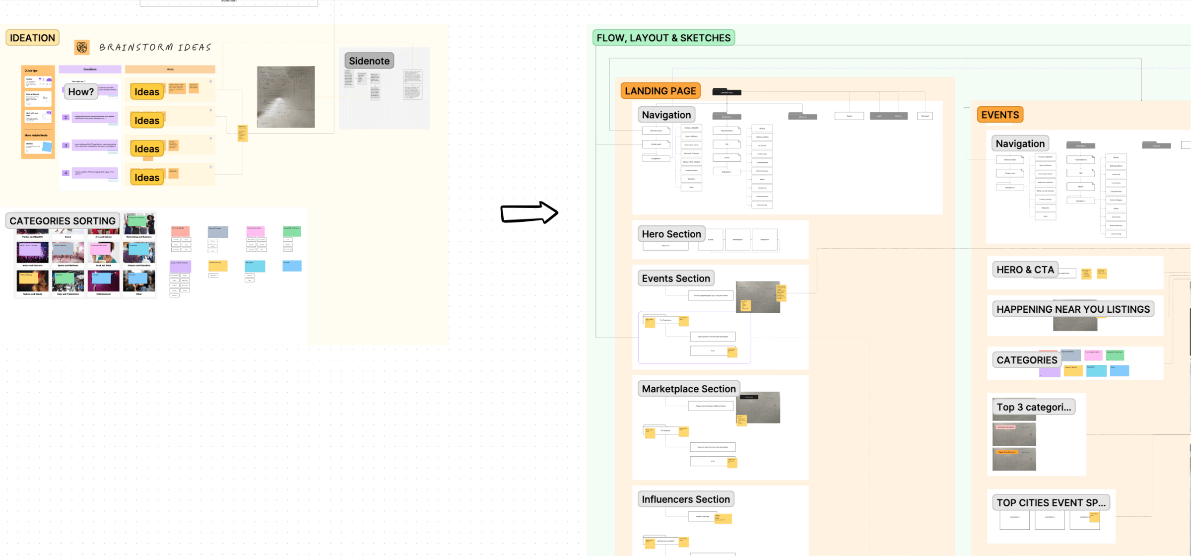
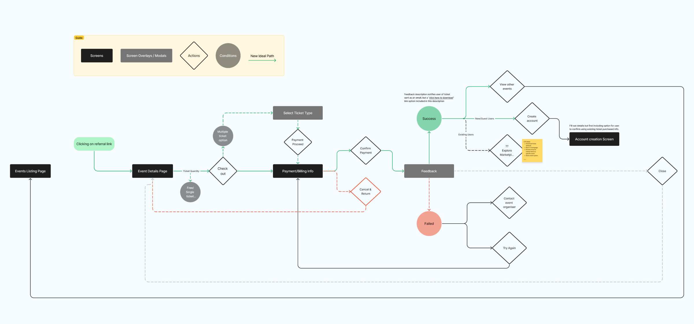
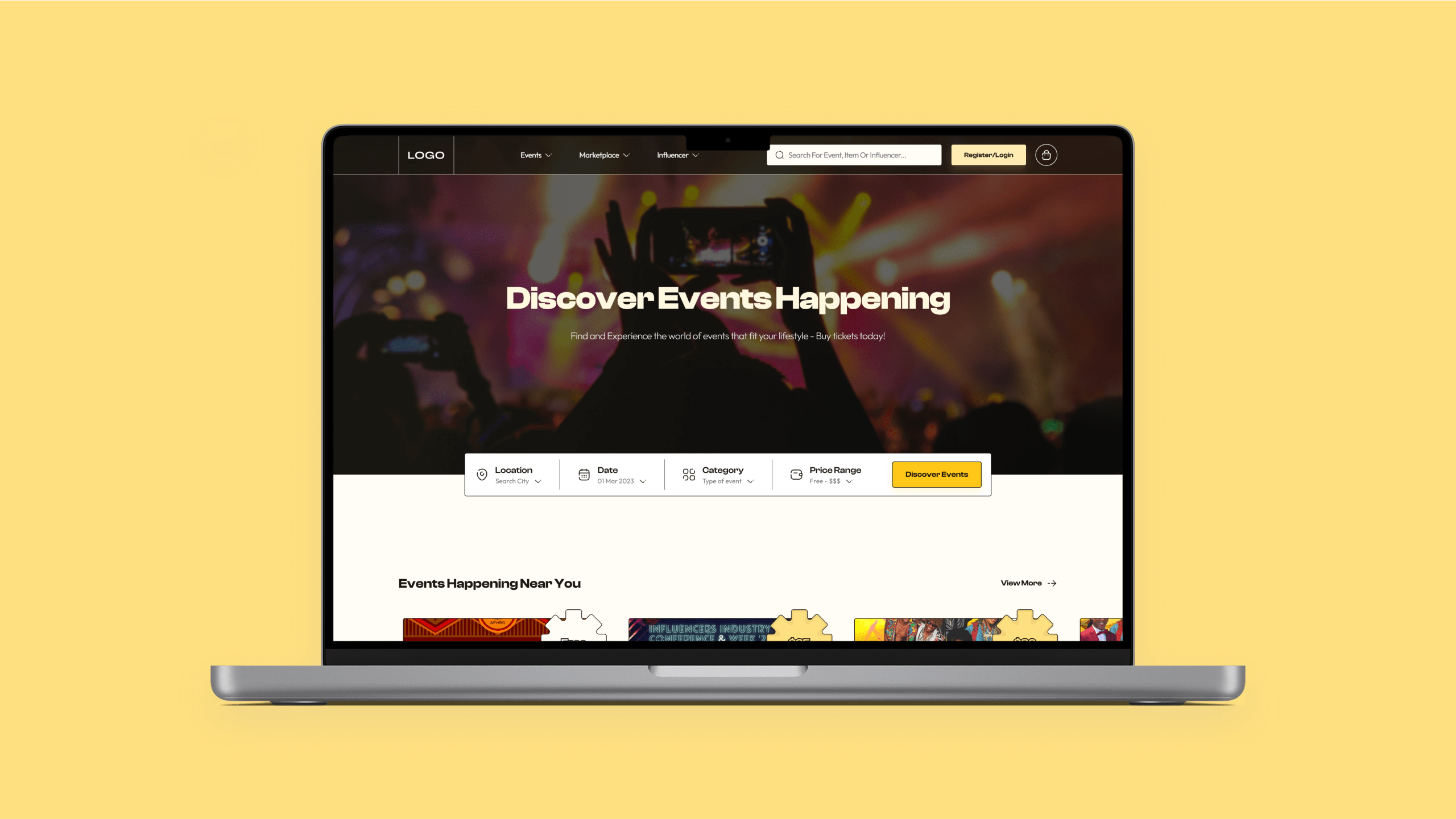
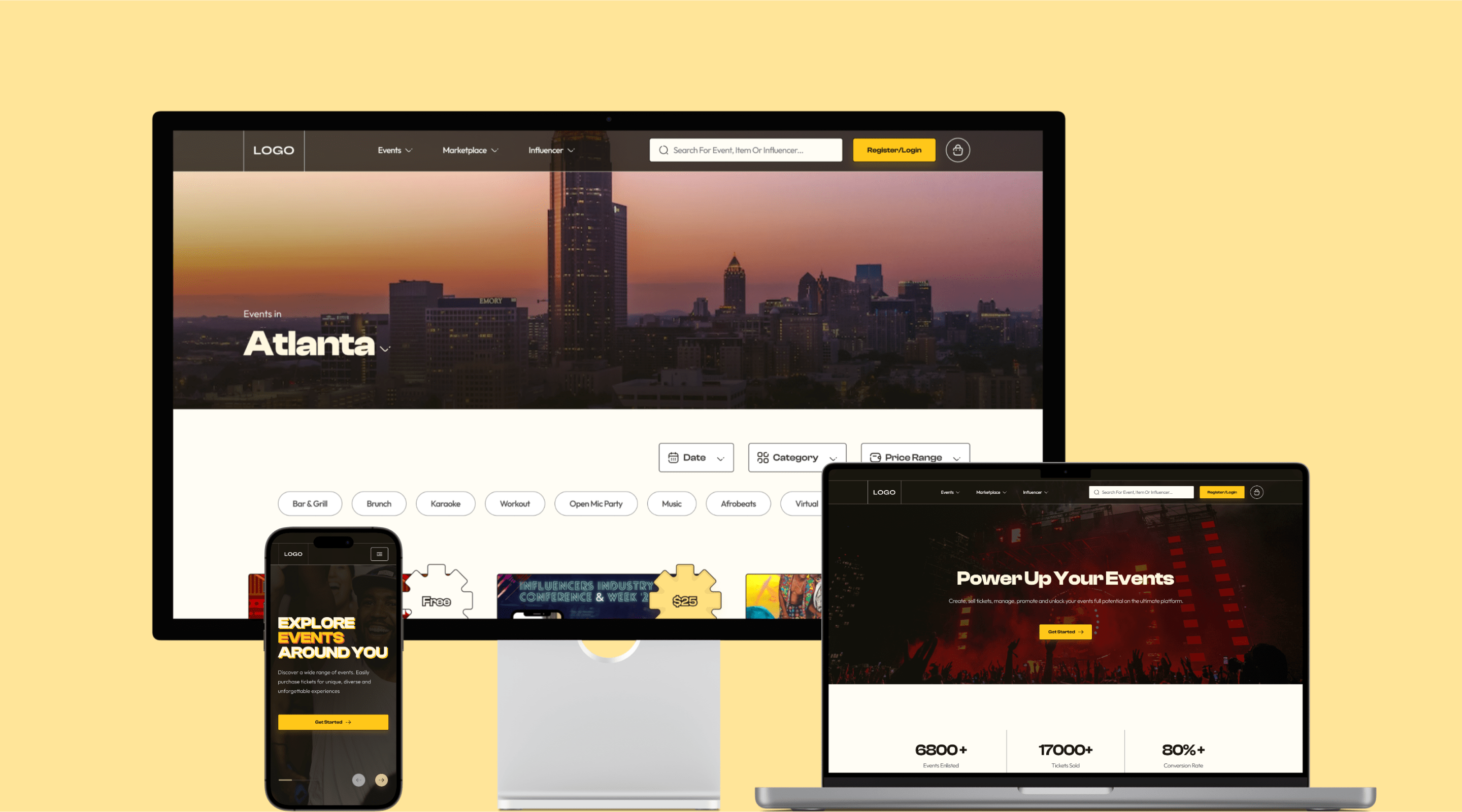
By looking at stakeholder examples and curated designs from multiple sources I developed paper sketches, then wireframes to visualise the new design flow.

Even though it wasn’t fully complete at the time, I made just enough screens to prepare for the second meeting.

A wireframe image

The Second Meeting

Two words: Total success! I got complete buy-in from the stakeholders by explaining my thinking process, even though we had some discussions about certain aspects that could be resolved later.
To me, the best parts of this meeting were discussing a bit on how to track the  progress and success of the possible solution and their eagerness to see a polished prototype (hence, a possible contract).

Monochrome to Colour

The visual design was probably the ‘make or break’ part of this design proposal which I am pretty sure was the latter. With the notion of trying to grab visitors' attention, create excitement and with no brand guidelines explicitly established, I risked switching the platforms' colour from a "red" to a "yellow"-ish tone. I was leveraging research data on colour psychology before making the decision.
In addition to my visual design goals, I wanted to highlight the necessity of a design system for the platform. I leveraged atomic design principles to build a library of styles and components then showcased how changes like switching the colour could be made easily during the final presentation.
The design library showing the various parts and components used for the Speso platform redesign.

Event Highlighters

My research findings which includes data from experienced event managers show that people attend events for various reasons such as keynote speakers, artistic performances, or even free food. The idea of “event highlighters” is to illuminate and emphasise these incentives to catch users' attention.
The old/initial event listing card
Old event card design
The newly proposed/redesigned event listing card
New event card design with
Event highlighter
The example above is a quick look at a random event on the platform with the current and proposed event cards featuring the event highlighter (assuming the surprise artist was Burna Boy). It was also important to ensure users had sufficient information to quickly make decisions.
Chapter 4
Resolution

Encouraging Platform Exploration

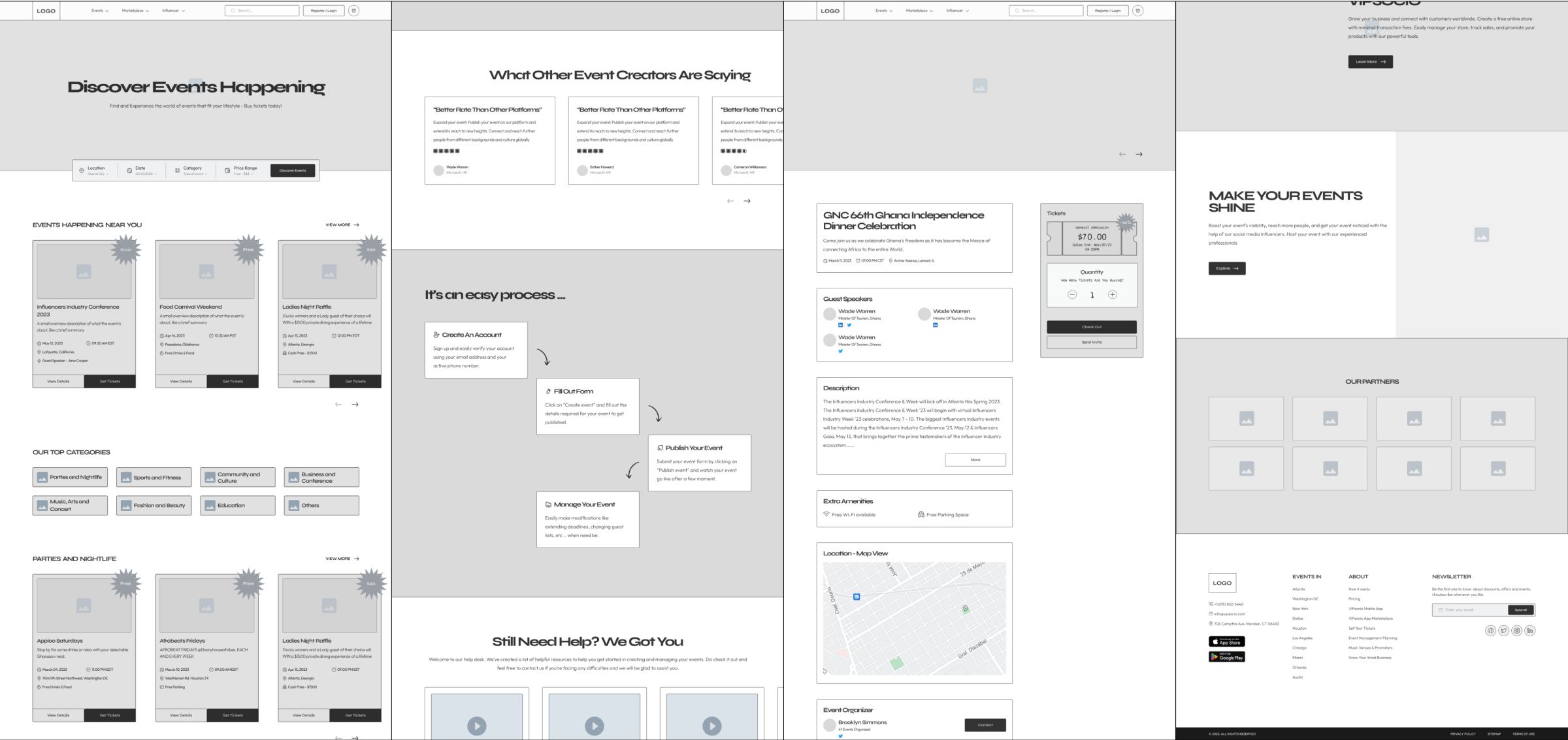
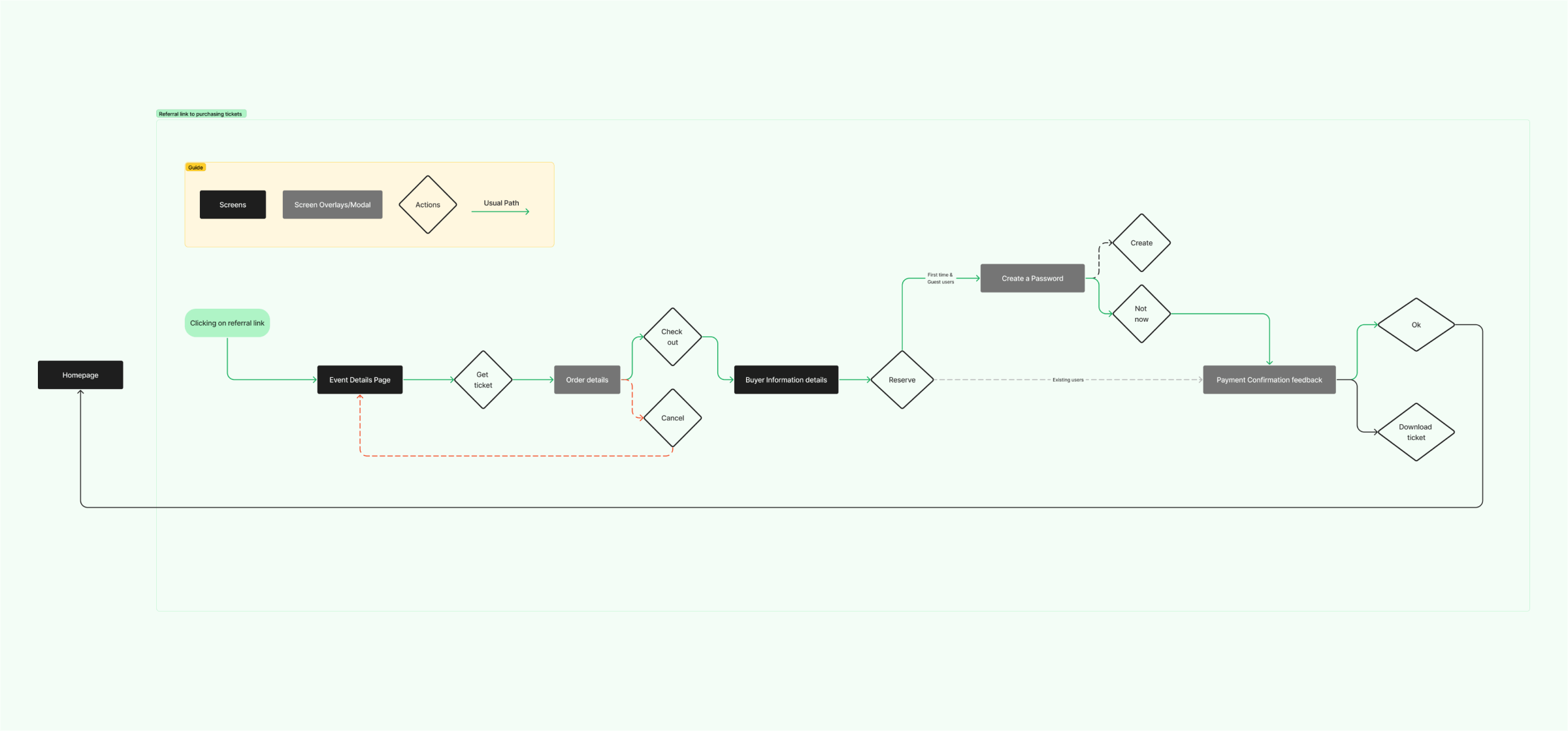
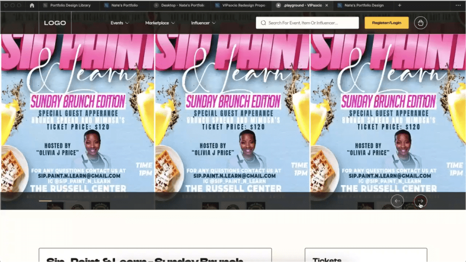
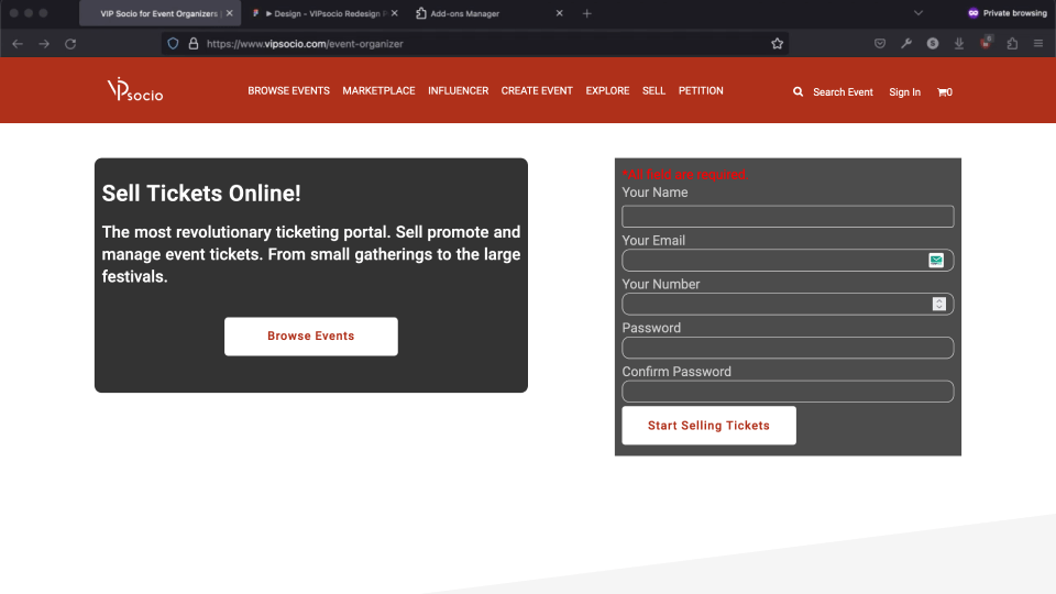
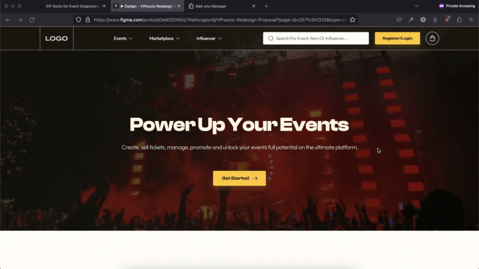
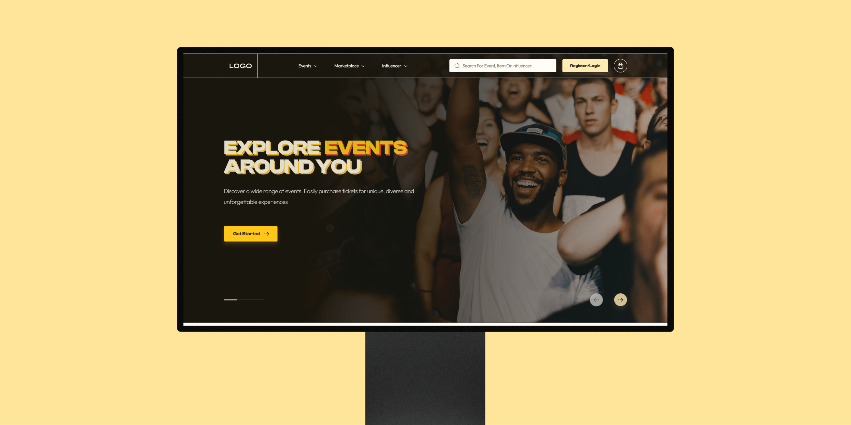
Below is a preview of the proposed ticket buying process in comparison with the old, featuring updated CTA labels that prompt users to discover more of the platform.

New Event Organisers Page

The existing events setup page had clutter of information and lacked structure which might have made some organisers unsure about the platform.
I restructured and redesigned the page to clearly highlight the platform's benefits, and backed that up using data to allude confidence to event creators.

Appealing to a Wide Audience

Whilst I am by no means indicating that one shouldn’t be expressive of their culture or heritage, the intonation of elements like language or imagery used throughout the platform to some degree alluded exclusivity to only black folks.
To appeal to a wider audience, I simplified the language and incorporated neutral visuals featuring individuals from different ethnic backgrounds
A large desktop mockup of the VIPsocio landing page
Chapter 5
Denouement

Third & Final Meeting

Underwhelming! The meeting didn't have the same impact as before. I carried on from the previous meeting, walking stakeholders through my thought process and presenting some data to support my proposed visual design direction. I demonstrated the ease of changing certain aspects; like reverting back to the original colour.

Unfortunately, it fell short and the visual redesign wasn't considered modern enough to proceed.

User Testing

In the second meeting, we briefly discussed the potential success of the proposal. The plan involved testing the new design with event organisers and users to gather feedback before implementing and gradually improving it.

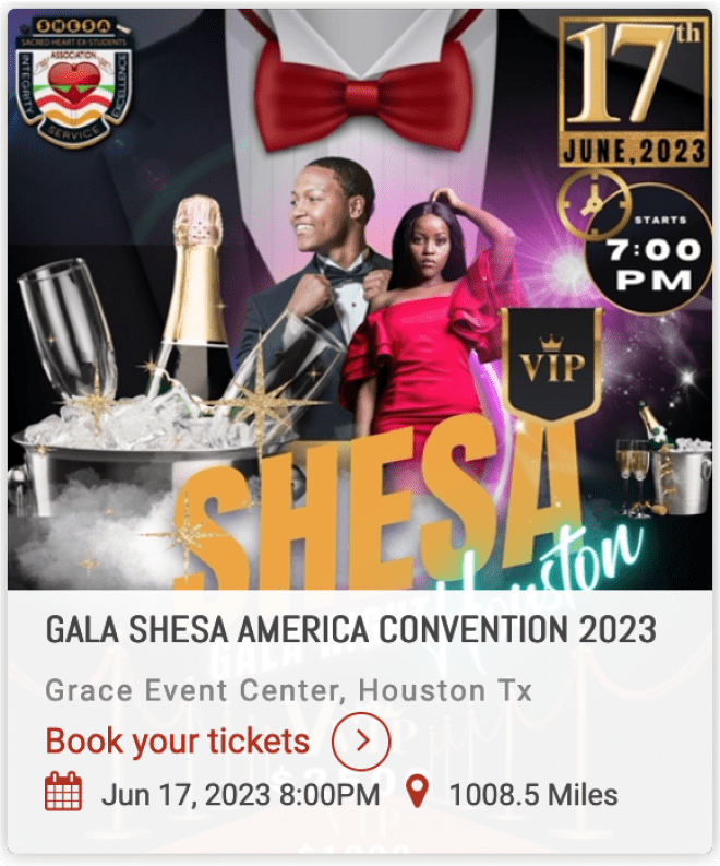
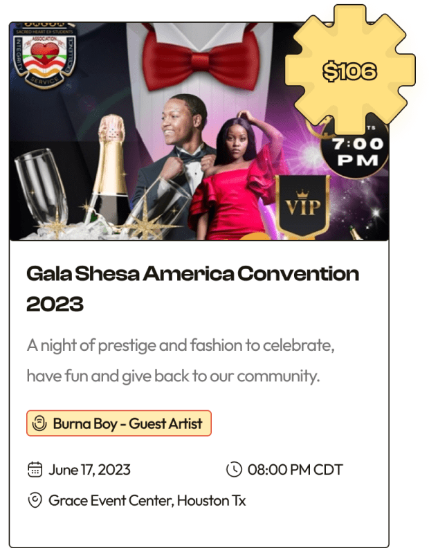
I still conducted guerrilla testing with people, using the existing design as a benchmark and then introducing the newly proposed design to validate my decisions and measure improvements:

  • User exploration of other sections of the platform increased by 75% after ticket purchase.
  • Ticket purchase time reduced by 35% on average.
  • Ranking ease of use (usability) on a scale of 1 (very difficult) to 10 (very easy), the old design averaged a 7.75/10 score whilst the new design averaged a 9.38/10 score rating.
  • Task success rate (of buying tickets) improved by about 5%.
  • There was some engagements with the event highlighter feature as some made remarks on various event listings.

The overall results were highly positive, indicating the significant impact the redesign could have had if implemented.

Project Reflection

In retrospect, this redesign proposal encapsulates a journey marked by resilience and continuous learning. Acknowledging that outcomes can be victories or valuable lessons, I recognize the potential benefits of incorporating quick user tests and maintaining design consistency.

The project served as a crucible for refining my decision-making and critical thinking skills. Navigating tight deadlines and limited information unveiled insights into effective prioritization. Ultimately, this experience highlights the pivotal role of research, iterative design, and usability testing in driving impactful improvements.

Moving forward, the lessons learned from this study serve as a foundation for continued improvement and innovation in creating meaningful and intuitive user experiences.